
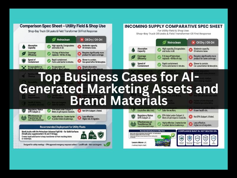
When creating infographics and branded assets with AI Tools it is important to closely edit the result. If you are new to creating graphic design, you may be so distracted by the amazing images the tool generates that you miss little details that a seasoned and talented graphic designer would catch. Are there elements that don’t make sense for your scenario? Are the proportions off?
And text. It is key to read every word, inspect for clarity. If you start with a concept, it is important that the tool aheres to the best version of that concept. If it changes, for example, your layout, question its reasoning for doing so. There are reasons we layout work the way we do. Maybe your layout it counter-productive to your ultimate goal. But don’t just take its word for it. Have it prove it. If you don’t agree, stick with your original idea. Your community wants “you”. If you start with a template, don’t be afraid to make it your own. Not just changing colors. Maybe you were never into a slasher font. Just because its trendy isn’t a reason to do it. I hear some old tv parent saying, “if your friends jump off a bridge will you?”.
So your game to make the change, but don’t have a clue what I am talking about? Made a roadmap. Here you go⬇️.
Start with a clear concept or approved template Define your core message, layout, and goal before generating anything. If using a template, treat it as a starting point only — make it fully yours (not just color swaps). Avoid trendy fonts or styles that don’t fit your brand just because they’re popular.
Generate the base asset with your preferred AI model. Create multiple versions. Download your top 3 favorites to use as building blocks.
Upload the generations into your design tool Open Canva, Adobe Express, or your preferred graphic design app and import the AI outputs.
Inspect every element critically (zoom in)
- Do any elements fail to make sense for your scenario?
- Are proportions off?
- Does the layout still serve your original goal? Question every change the AI made. Ask it to explain its reasoning. If you disagree, stick with your original concept.


Fix and perfect all text
Read every single word for clarity, accuracy, and tone. If text is blurry or low-quality, take it into a strong editor and instruct it to regenerate the text at the equivalent of 600 dpi with the sharpness of typed text. When using AI for wording, pull only from your approved sources and always review and correct the output.
Assemble the final asset Combine the strongest elements from your top generations. Replace any placeholder or stand-in images with your real brand assets.
Export at maximum quality Download the finished piece at the highest resolution available.
Re-upload if needed and save a print-ready PDF. Choose CMYK color mode if your brand colors are based on CMYK.
YOU’RE
EDITOR-IN-CHIEF
THE AI TOOL
IS YOUR ASSISTANT
WITH A .PHD AND TOP HONORS BUT HAS NO REAL LIFE EXPERIENCE.


You must be logged in to post a comment.